AES timing variability graphs
D. J. Bernstein
Authenticators and signatures
A state-of-the-art message-authentication code
AES timing variability graphs
Introduction
Understanding the graphs
AMD Athlon
Intel Pentium M
IBM PowerPC RS64 IV
Sun UltraSPARC III
Introduction
See the separate page of
pictures
for an introduction.
Understanding the graphs
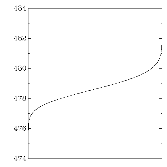
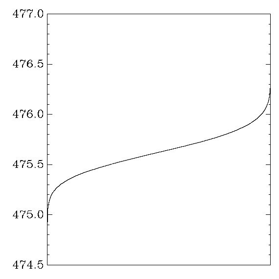
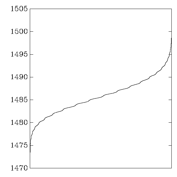
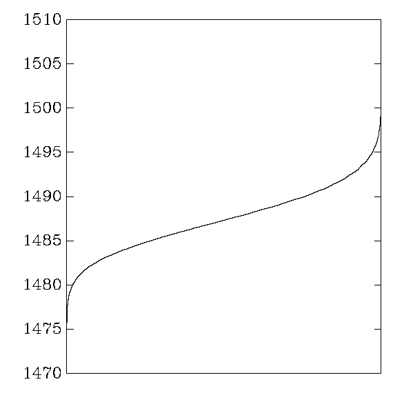
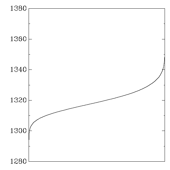
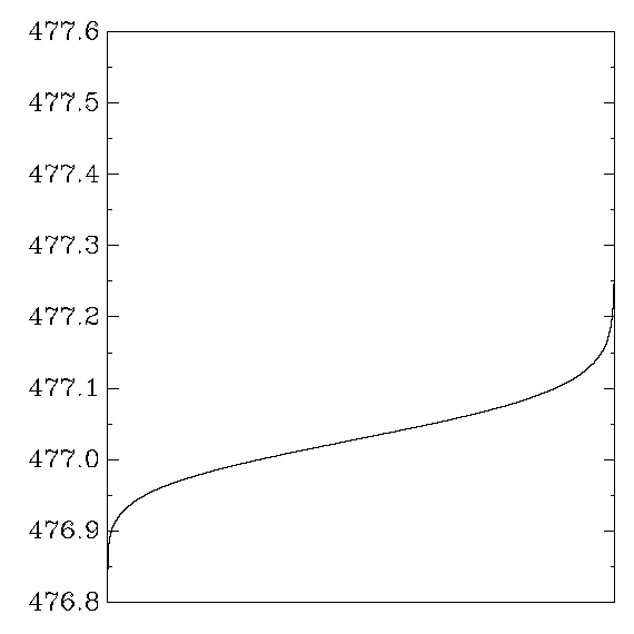
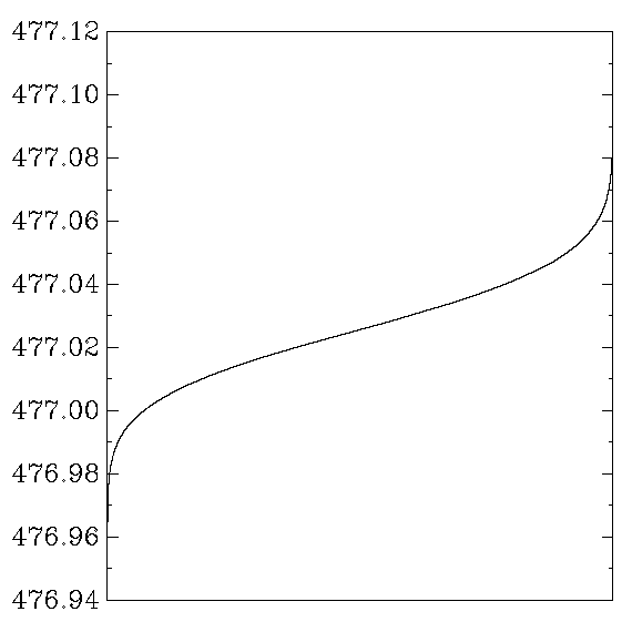
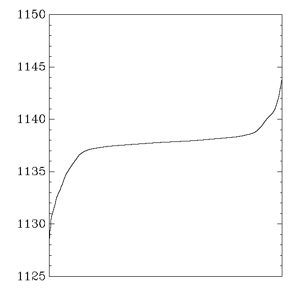
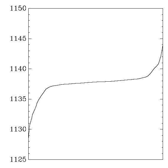
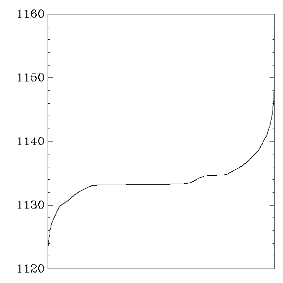
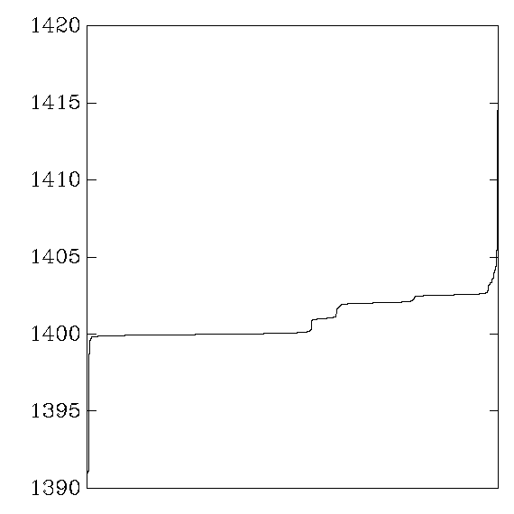
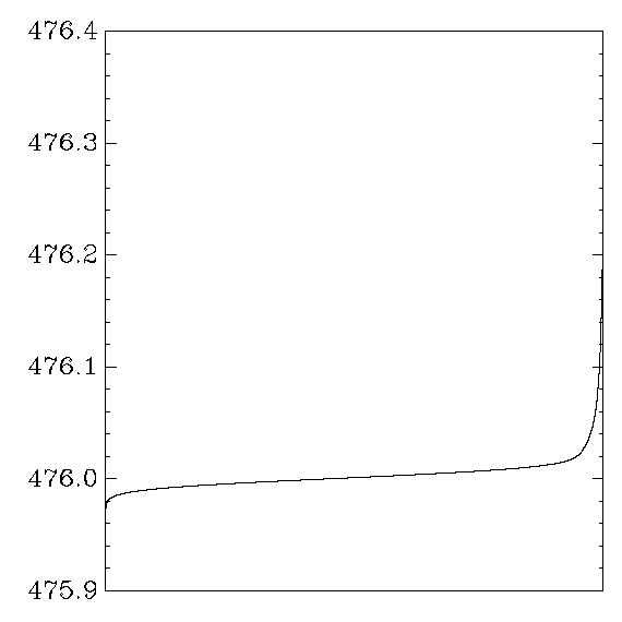
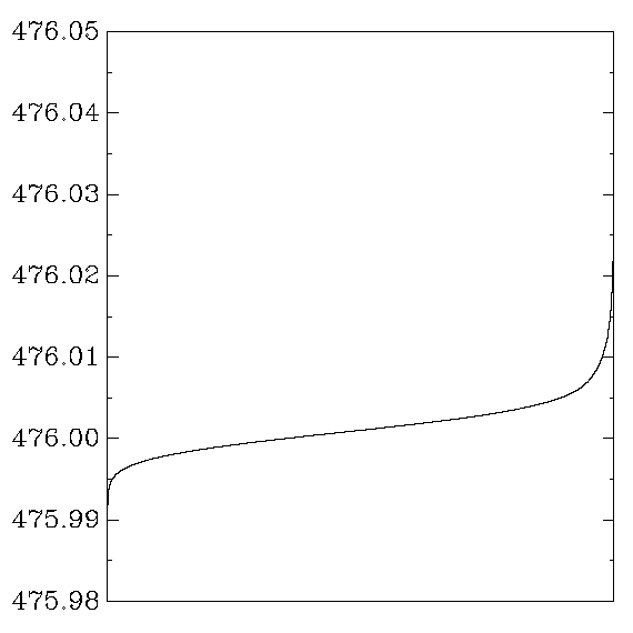
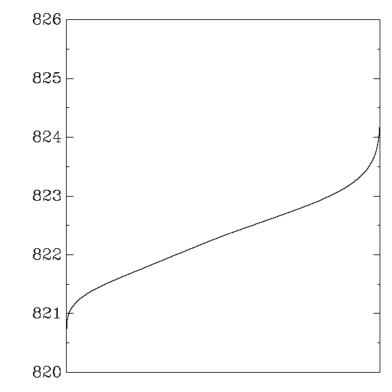
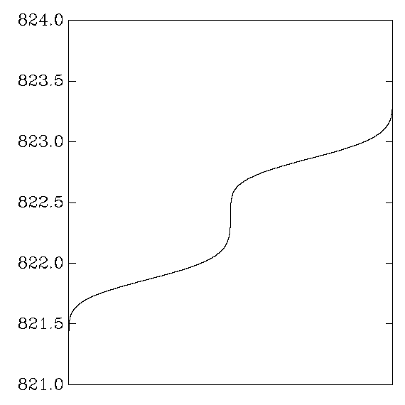
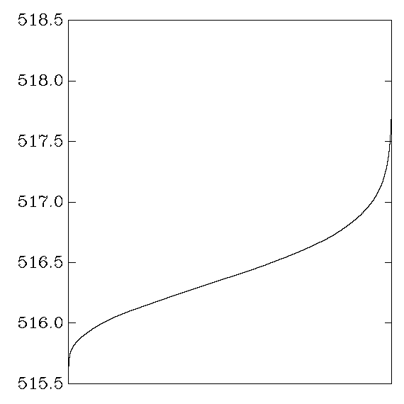
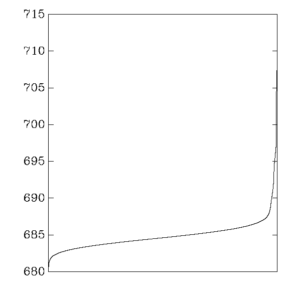
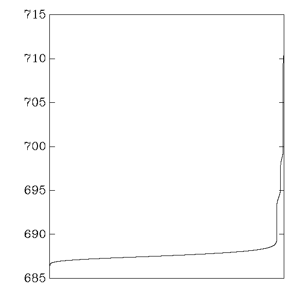
Each graph reports cycle counts for 256 AES keys and 256 AES inputs.
Each key was applied repeatedly to each input,
31000 times on average (or 310000 times when a second graph is shown),
in a random order.
The times for each (key,input) pair were averaged,
producing 65536 numbers,
which were then sorted and graphed.
In other words,
the graph shows the distribution of average cycle counts.
Averages are interesting from a timing-attack perspective
because they can easily be computed from noisy samples.
For example, a 10-cycle difference in averages
can be seen through 10000 cycles of noise
after roughly 1 million samples.
``Good'' graphs are close to a normal distribution,
with a small variance that depends on the CPU's time variance.
``Bad'' graphs have much larger variance,
and often several changes in convexity.
Here's how to generate your own graphs:
     ./v2 \
     | sort -n \
     | graph -a -x 0 65535 -N X -h 0.9 -u 0.05 -w 0.8 -r 0.17 -Tpng \
     > v2.png
AMD Athlon
OpenSSL:
Gladman:
My aes_athlon:
Intel Pentium M
OpenSSL:
Gladman:
Gladman, using 1K tables:
My aes_ppro:
IBM PowerPC RS64 IV
OpenSSL:
My aes_aix:

Sun UltraSPARC III
OpenSSL:
My aes_sparc: